Hospivan®
Where Structure Meets Care
Overview
Hospivan® is a healthcare solutions provider where structural solidity meets modern innovation. The challenge was to develop a visual identity that projects medical reliability and operational excellence while maintaining the human warmth essential to the care industry.

The Visual Strategy
The core concept was based on balance. We aimed to soften institutional rigidity through organic forms that represent adaptability and human connection.
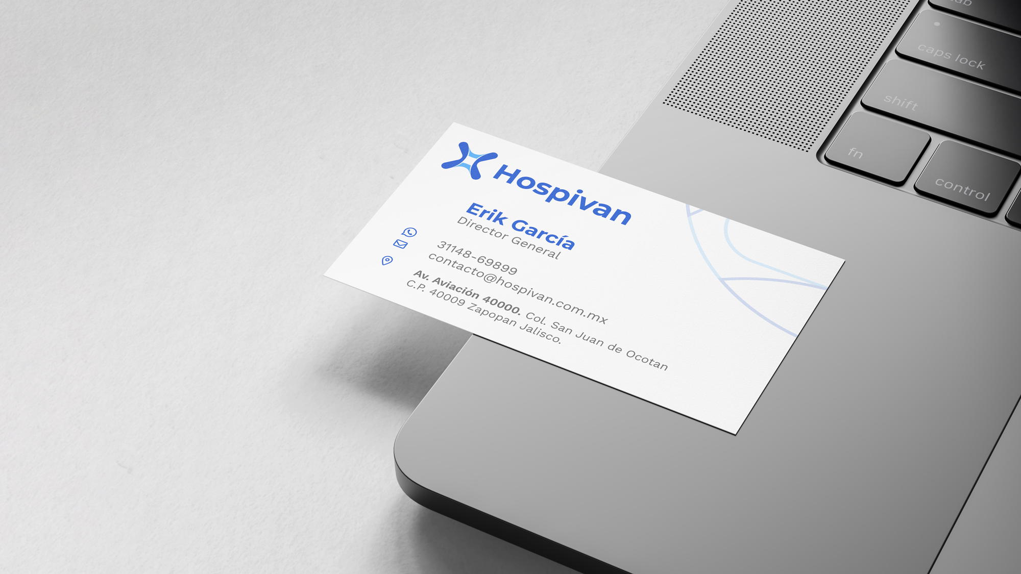
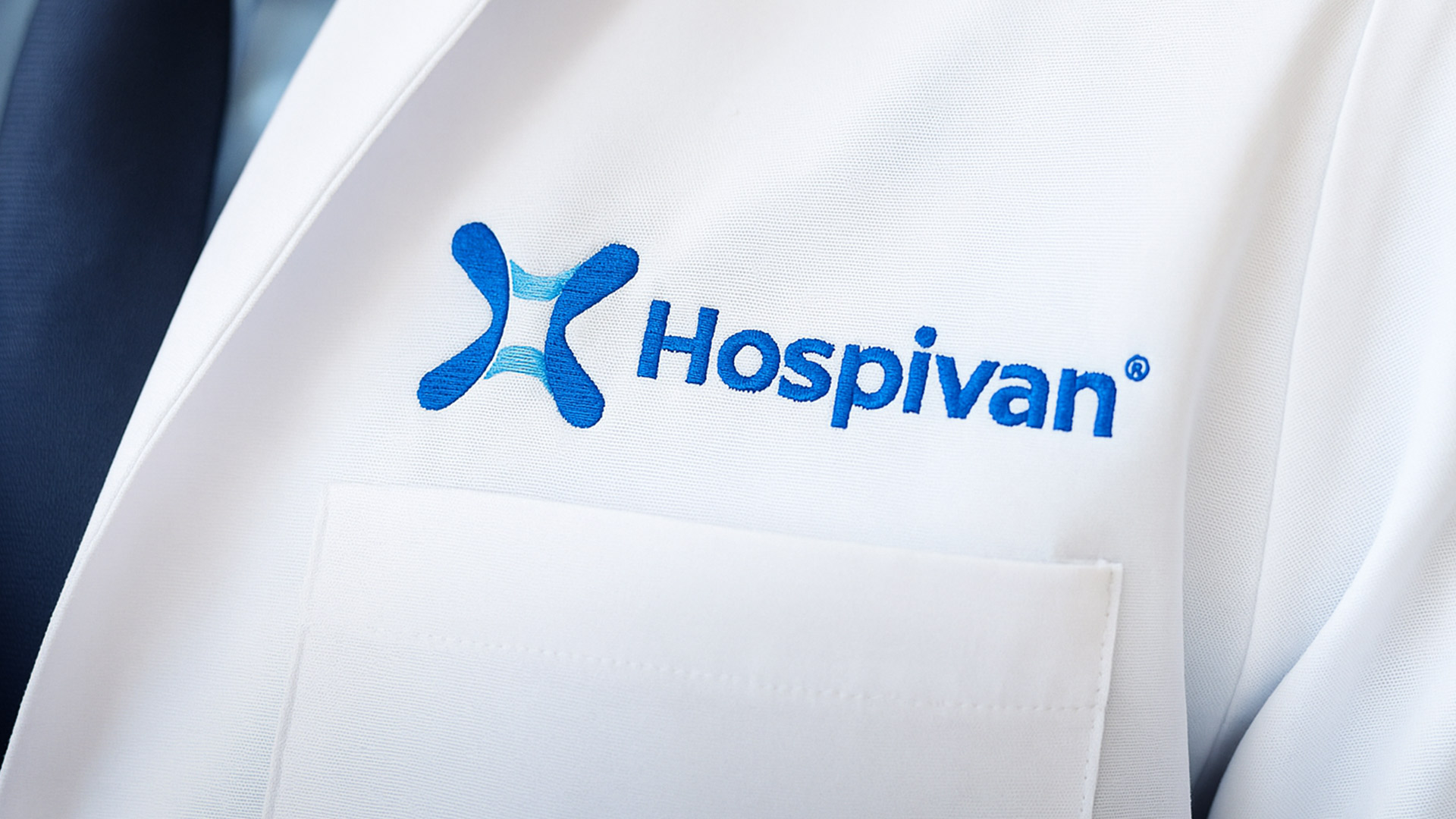
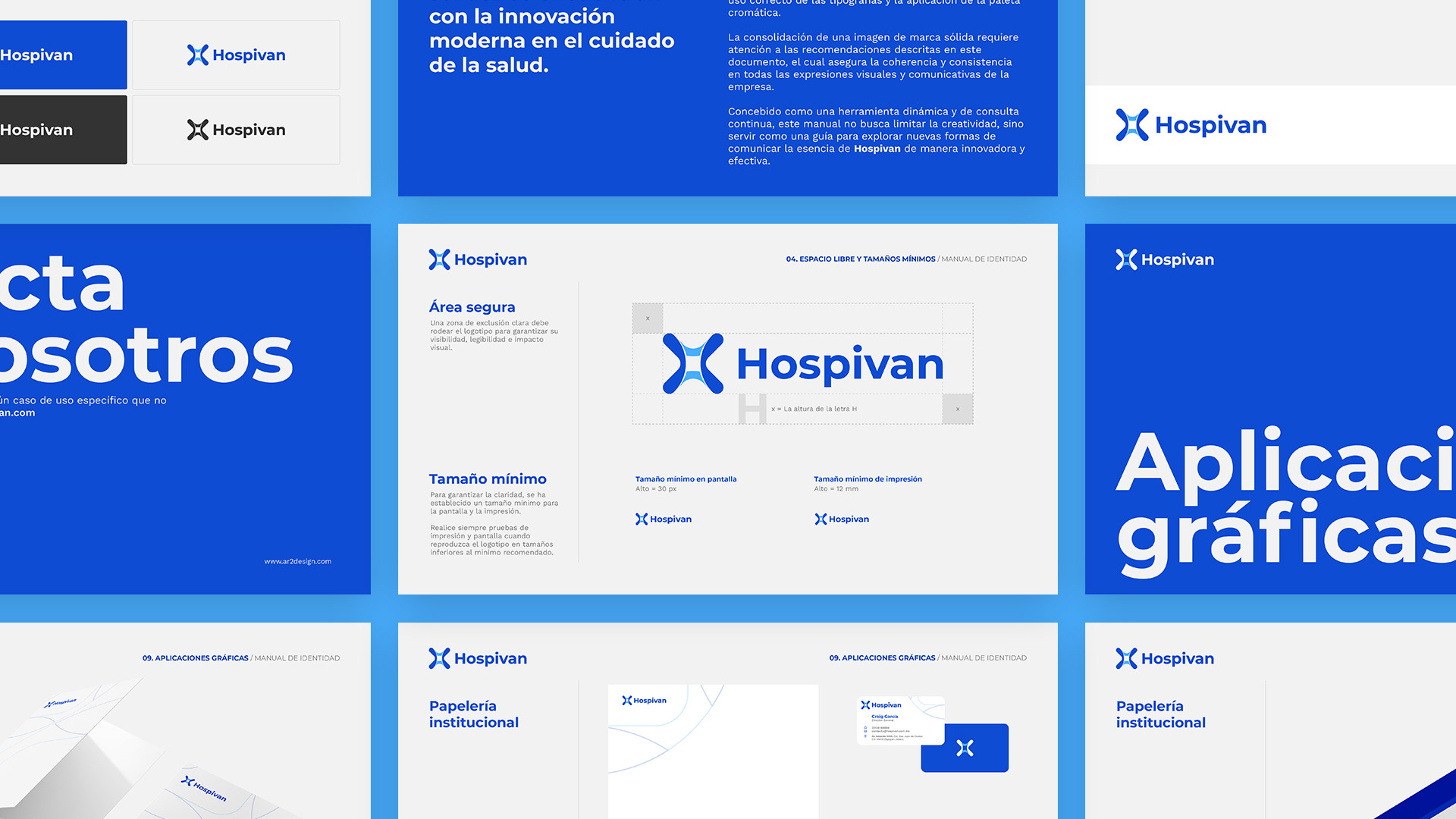
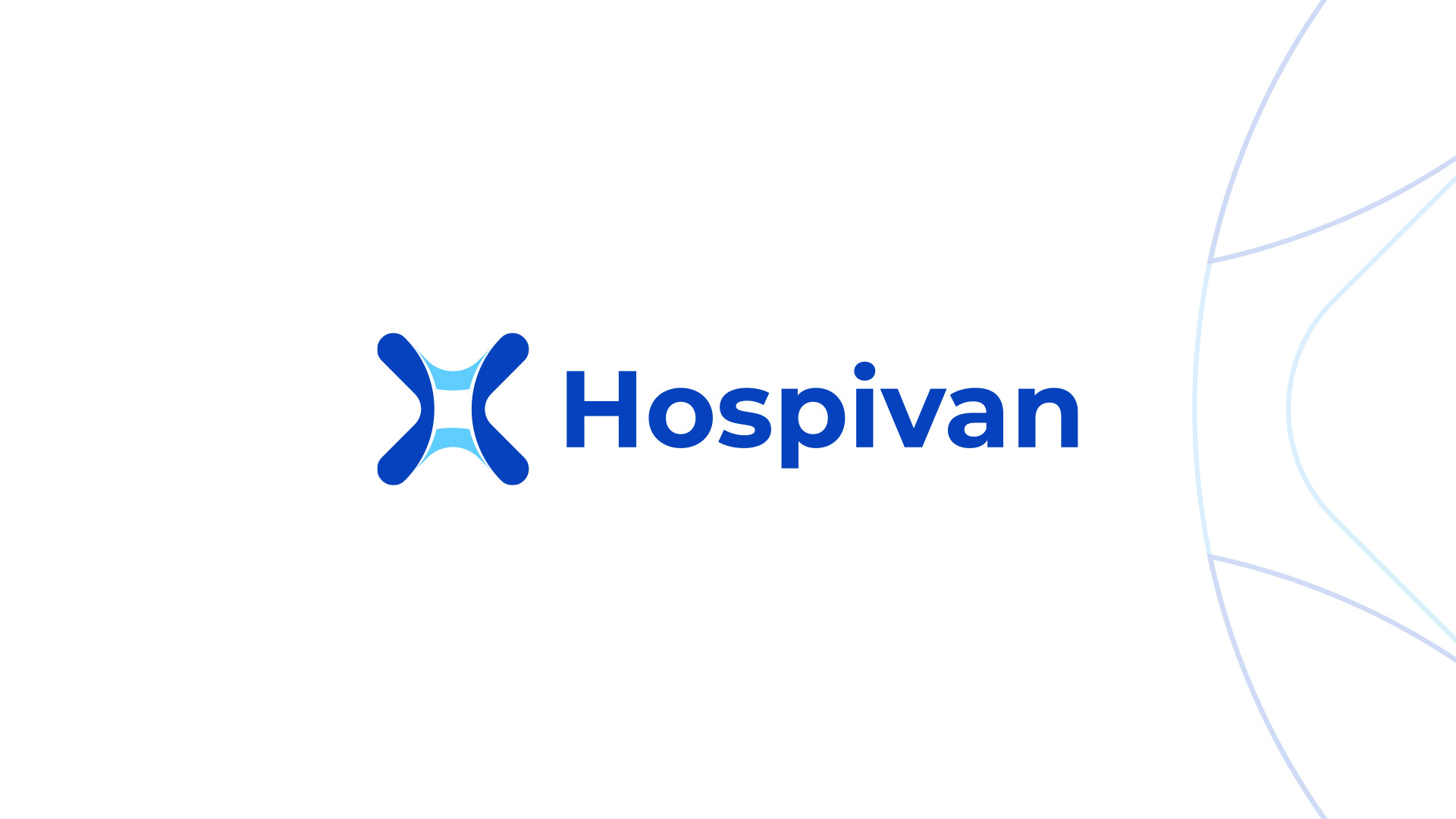
A symmetrical construction that merges the initials "H" and "V". The design uses fluid strokes to evoke movement and care, integrated into a solid structure that communicates professional backing. The symbol functions independently as a quality seal, allowing for versatile application across both digital and physical touchpoints. A palette of deep blues and teals was selected to reinforce hygiene, technology, and serenity.
The Result
A robust brand that positions Hospivan not just as a service provider, but as a benchmark for innovation and trust in the medical industry. The new identity allows for full scalability—from staff uniforms and fleet vehicles to complex digital interfaces.